Deliveroo Logo
Food delivery app.
Logo
About Deliveroo Logo
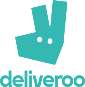
The logo features the word "deliveroo" in lowercase letters. The font is round and friendly, with smooth edges. The color of the text is a teal or turquoise shade. Above the text, there is a stylized image resembling a kangaroo's face and ears. The image is also in the same teal color and consists of two rounded triangles to represent ears, with a larger triangle beneath them to form the face. Inside this face-like shape, there are two small circles for eyes and a larger oval below them, suggesting a kangaroo's nose. The overall design is simple and modern, using minimal lines and shapes to suggest a kangaroo.
The Deliveroo logo is a technology logo made up of around 1 different colors.
This logo for Deliveroo doesn't contain any obvious shapes.
We have pulled the following text out of the logo: CIGHVGVOO.
The Deliveroo logo is a Deliveroo, Food And Drinks, Services, Technology and United Kingdom logo.
Deliveroo Logo Information and History
The Deliveroo logo is a recent change from the 'tiny kangaroo' that was a part of the previous identity. Designed by DesignStudio, the new Deliveroo logo has a more professional look, while keeping the kangaroo as the central element. Despite its chaotic look, the Deliveroo logo is still recognizable as a smartphone icon. Its angular shape, wonky eyes, and strange angles make it one of the most memorable logos in the industry.
The company's original logo was created by Will Shu, a designer with a background in computer graphics. Shu created the logo featuring a kangaroo with rounded ends, a 'D', which represented the company's brand name. The company commissioned DesignStudio to create the new logo, and the new design is much simpler and more elegant than the previous one.
The new Deliveroo logo ditches the 'dashed and splodged' design and opts for a simpler, flat design that matches its courier uniform. Its logo design has been compared to the look of a kangaroo sticking up two fingers. The company has also made changes to its website and packaging. Aside from the new logo, Deliveroo has also rebranded its drivers to reflect the new brand image.
The Deliveroo logo comes in various sizes, and is available in EPS, PDF, and SVG vector formats. While its font style is more recognizable than the 'fancy' designs of many other logos, it's difficult to spot the Deliveroo logo without proper context. Luckily, the Deliveroo logo is available in SVG format, which makes it easy to drag and drop. It's also highly customizable, with resizing and positioning no problem.
Basic Colors
We've taken a look at the image and pulled out some colors that are common across lots of logos. The colors below aren't the exact colors found in the image, but approximations to common colors.
Advanced Colors
We've extracted the below 'advanced colors' from the logo. These should be much closer to the actual colors found in the logo. Our extractor tries to only take the main colors of the image and tries to ignore shading on anti-aliasing or shadows. This generally leads to better results, but in some circumstances you might find a few unusual colors being pulled from the logo.
Hex Colors
The below are the hex colors that are found in the logo. You can assume that these are the actual colors used in the logo. Our color extraction tool that takes the colors from the logo tries to ignore anti-aliasing and shadows, so you may sometimes find a slightly odd result, but this is rare. These colors should be very similar to the Advanced Colors, but you'll notice subtle differences. If you're interested in the exact color then use the hex, but if you're trying to describe the logo then use the Advanced Color or the Basic Color above.
Similar Logos
The following logos are similar to this logo.


World Class Bartenders
- black
- purple
- silver
a logo for yours, the most important competition of bartenders
View Logo


